

POCOS
POCOS — UI Redesign & Illustration for a Post-COVID App
Short description
Illustration and UI redesign for POCOS, a self-management app for people experiencing persistent symptoms after coronavirus infection. Hired to illustrate, I proposed a visual overhaul that unified the interface and made the experience genuinely appropriate for its users.
The Client
POCOS is a self-management and rehabilitation app developed for people suffering from persisting symptoms after coronavirus infection—commonly known as Long COVID. The app combines growing medical knowledge about post-COVID syndrome with an AI-driven approach, connecting patients with other users and healthcare professionals to help them monitor their symptoms and support their recovery.
The Brief
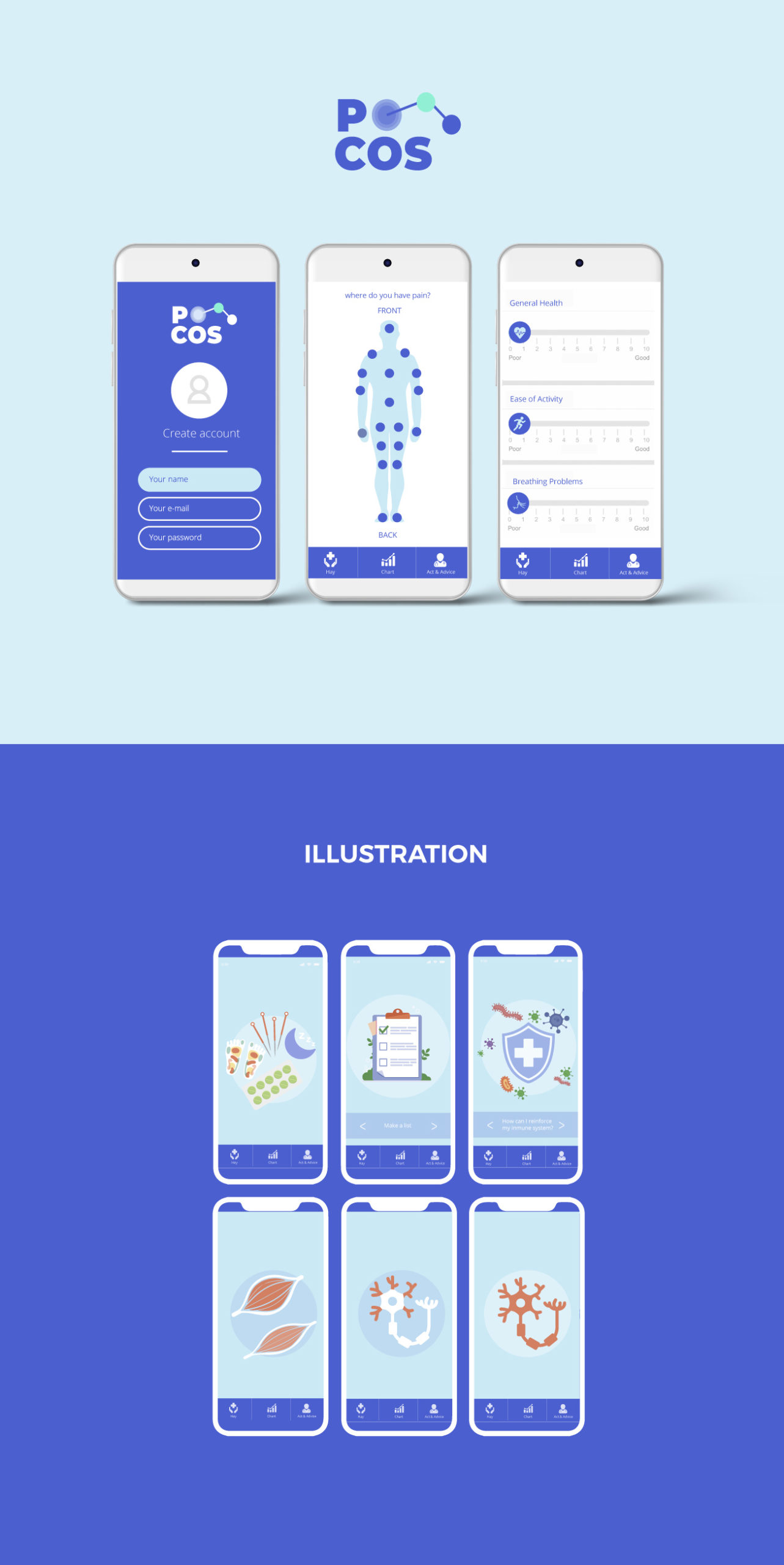
The original brief was focused: illustrate 50 steps of the recovery process — meditation, light exercise, medication, and healthy nutrition — following their existing brand guidelines, and produce UI mockups for the development team to implement. A clear, contained scope.
Going Beyond the Brief
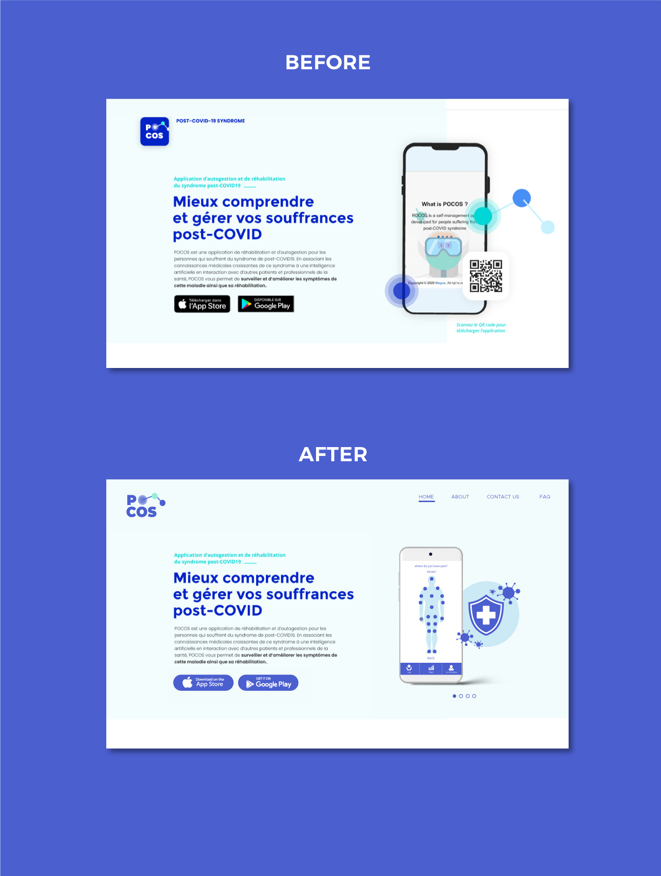
Looking at the existing app, I noticed that the visual experience didn’t match the needs of its users. The original interface was visually busy—inconsistent colors, mixed illustration styles, and a tone that felt more energetic than reassuring. For someone dealing with fatigue, brain fog, or chronic pain, that kind of visual noise adds friction at exactly the wrong moment.
I proposed a subtle but meaningful visual refresh alongside the illustration work. The redesign consolidated the color palette into a calm, cohesive range of blues—keeping the existing brand direction but stripping back the inconsistencies. The body map for pain tracking, the symptom sliders, and the navigation bar were all brought into a single unified visual language. The result is an interface that feels quieter, more trustworthy, and easier to use for people who are not well.
The Illustrations
The 50 illustrated recovery steps cover a wide range of content — from medication and breathing exercises to immune system education and muscle recovery. Each illustration was designed to be warm and accessible without being clinical or alarming, matching the calm tone of the redesigned interface. The set also includes scientific illustrations of cells, neurons, and pathogens that needed to feel informative rather than intimidating.
The Deliverables
50 illustrations for the recovery journey, UI mockups for the development team, a subtle visual redesign of the app interface, and an updated website landing page — all built on the client’s existing logo and brand foundation.
ServicesUI Design and IllustrationsYear2021