
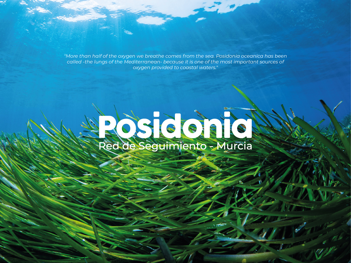


Posidonia – Red de Seguimiento Murcia
Brand Identity for a Marine Conservation Program
Short description
Visual identity for POSIRED, the long-term scientific monitoring network for Posidonia oceanica meadows in the Region of Murcia, Spain — a program at the intersection of marine conservation, citizen science, and coastal protection.
The Context
Posidonia oceanica is not seaweed—it is a flowering plant endemic to the Mediterranean Sea and one of its most vital ecosystems. Known as the “lungs of the Mediterranean,” its dense underwater meadows produce oxygen, shelter hundreds of marine species, store vast amounts of carbon, and protect coastlines from erosion. Despite its importance, it is under serious threat from human activity and climate change.
The Client
POSIRED (Red de Seguimiento de las Praderas de Posidonia de la Región de Murcia) is a long-term scientific and conservation program launched in 2004 by the Region of Murcia’s Fishing and Aquaculture Service in collaboration with the Spanish Oceanographic Institute (IEO). The network monitors the health of Posidonia meadows along the entire Murcian coastline — from Águilas and Mazarrón to Cabo de Palos — and brings together scientists, divers, volunteers, and NGOs like WWF in an active citizen science effort.
The Challenge
The program’s existing logo had become outdated and no longer reflected the scientific credibility and public engagement the network had grown into. A new visual identity was needed—one capable of communicating across two very different audiences: the scientific and institutional community and the general public, including coastal communities, recreational divers, and tourists whose behavior directly impacts the meadows. The brand had to feel credible and rigorous while also being warm, accessible, and inspiring enough to drive citizen engagement.
The Concept
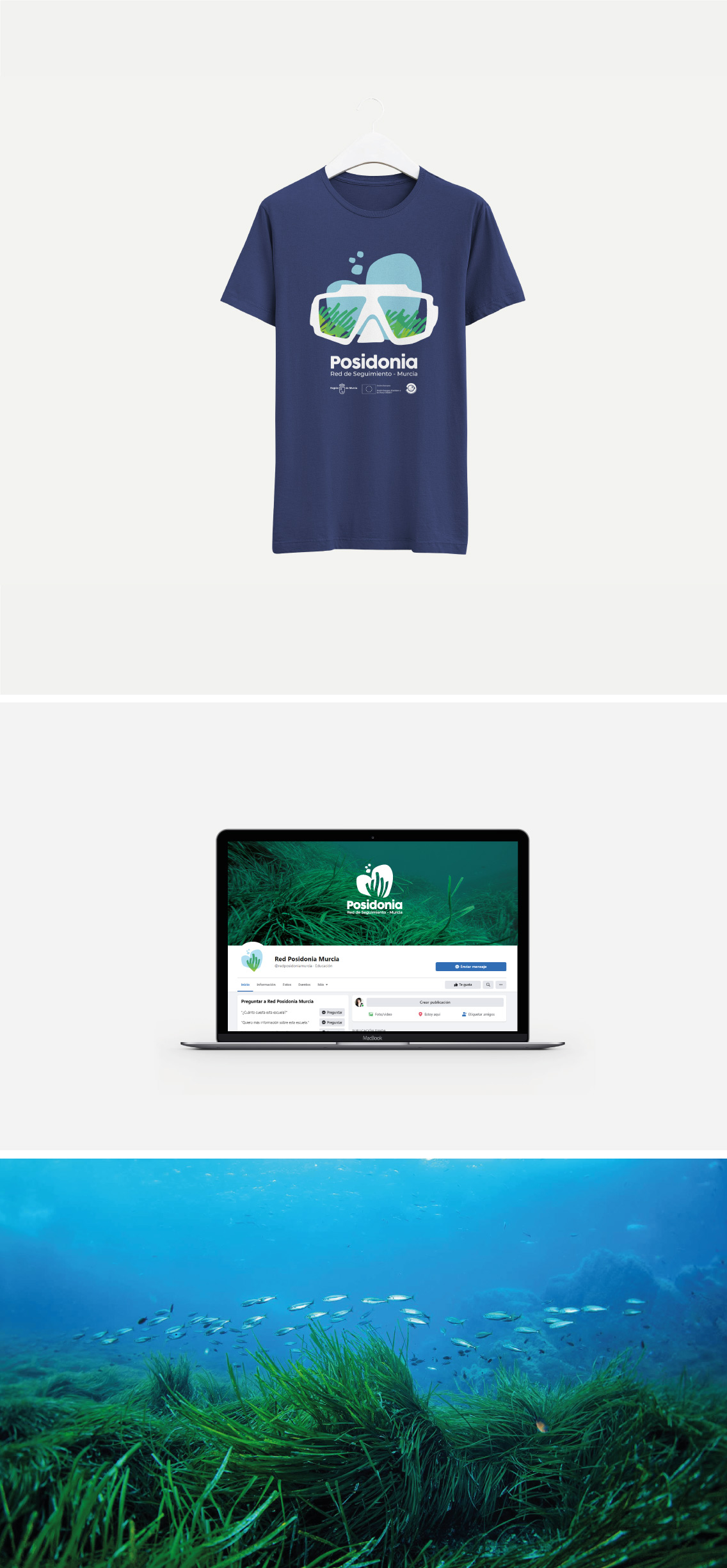
The central design challenge was to capture the essence of Posidonia—its flowing form, its colors, the water that sustains it, and the human care dedicated to protecting it. The logomark resolves this beautifully: the seagrass blades are shaped into an open hand, merging the natural form of the plant with the gesture of stewardship. It communicates both the ecosystem and the human effort to preserve it in a single, elegant symbol.
The color palette is drawn directly from the underwater environment—deep navy for the sea, fresh greens for the meadows, and aqua tones for light filtering through water. The result feels completely authentic to the subject without relying on clichéd marine imagery.
The Deliverables
The identity was applied across a full range of touchpoints: logo and brand system, social media (including Facebook page design), merchandise (t-shirts, caps, tote bags, water bottles, and stickers), and digital communications. The merchandise range is especially fitting—a reusable water bottle and tote bag as branded objects carry a quiet environmental message that reinforces the program’s mission.
ServicesBrand Identity ClientInstituto Español de Oceanografía. Murcia, SpainYear2021